In the web design world, custom 404 pages are trendy. A great 404 page will do two things: Inform the user that the page requested cannot be found, and distract the user from the fact that the page requested cannot be found.
Well designed 404 pages can alleviate the annoyance of arriving at a dead page. But that doesn’t mean that it has to be a dead end. Generic 404 pages serve no purpose other than to inform the user that the page can’t be found, without providing any alternative navigation or support. All that the user can do is either close the page or, if they’re really determined, hit the Back button. A default or unhelpful 404 page can be the difference between a user converting on your website or on your competitor’s.
Read our 404 page tips below,
or scroll down to see some of our favourite examples of a successful 404 page!
404 Page Design Tips
- Clear explanation of the 404 error.
- Keep in theme with your website’s branding.
- Include a search bar, so users can find exactly what they’re looking for.
- Links to the most popular pages.
- Contact details, in case the user is a client or customer who might get less frustrated contacting you directly.
- Keep the overall design seamless with other pages, so users know that they are on the same website.
- Consider using Call-To-Action buttons.
- Be friendly!
Should you 301 redirect from a 404 to the homepage?
This is often advised as not being best practice. If you want to do this, to poke your users in the right direction, ensure that there’s a delay so that they know why they are being redirected back to the homepage. This prevents any confusion, which can lead to frustration if they repeat the same steps to the page they 404’d on before. Ideally, though, you want to present the custom 404 page and give them the option of returning to the homepage. Or at least inform the user that they will be redirected to the homepage in 10 seconds, if they haven’t navigated off the page.
![]()
Interactive 404 Pages
Interactive 404 pages can distract your user for a few seconds or a few minutes, as sort of a small compensation for them being unable to arrive at the page they were expecting. It can feature Easter eggs, something to click around on for brief entertainment value or a fully fledged mini-game! By entertaining customers in this way, it can often make users feel as if they’ve stumbled upon a secret. Something exclusive. Something that was worth them not being able to find what they were looking for.
Kualo – https://www.kualo.co.uk/404
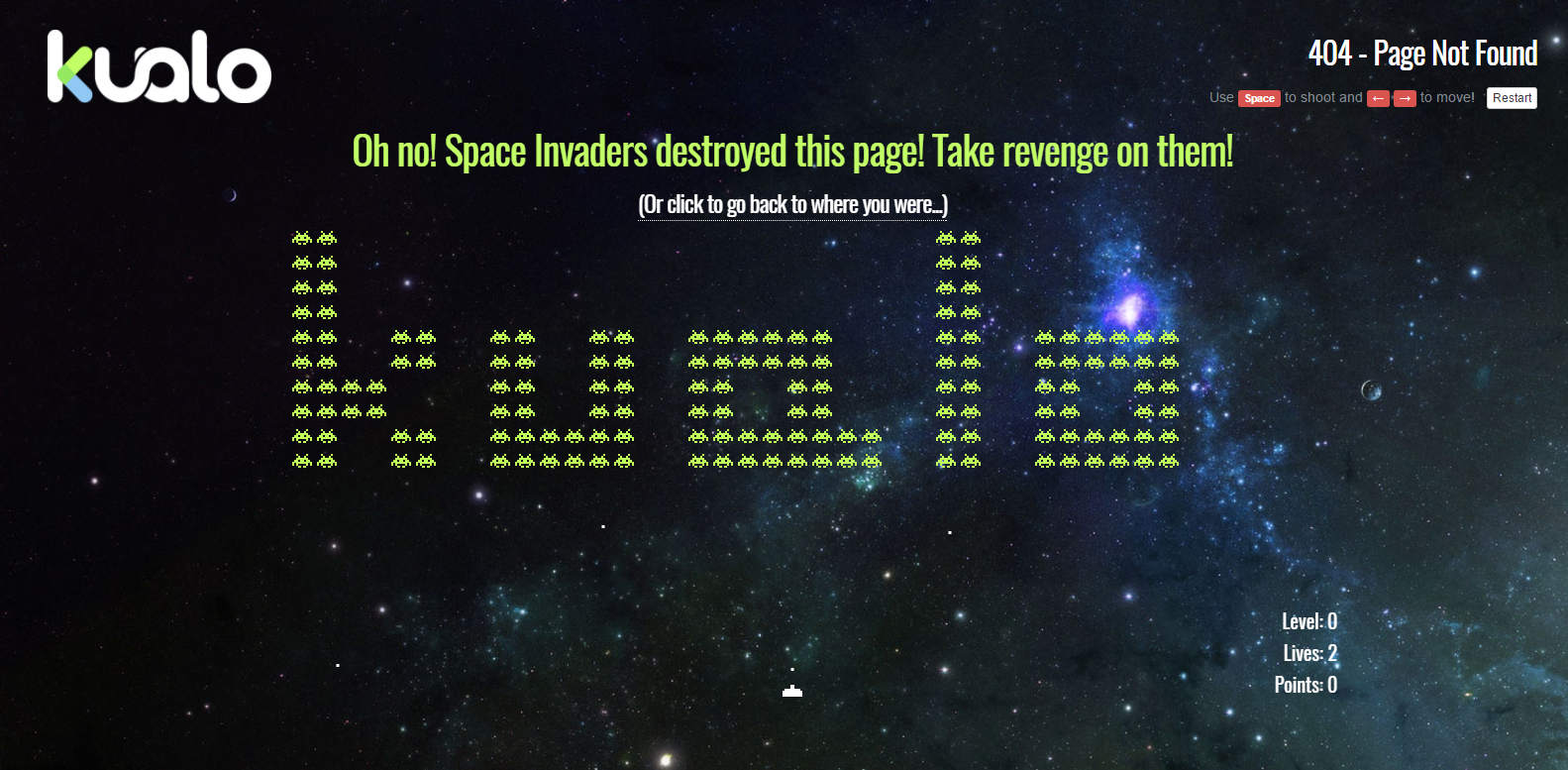
Kualo’s 404 page lets you play a game of Space Invaders. Complete with branded space invaders depicting the company name and a score board, which can encourage users to share the 404 page with their friends to compete with eachother’s high scores, pushing brand awareness. Not only that, but it provides a quick link for the user to go back to the page they came from if Space Invaders isn’t their cup of tea.
HotDot – http://hotdot.pro/en/404/
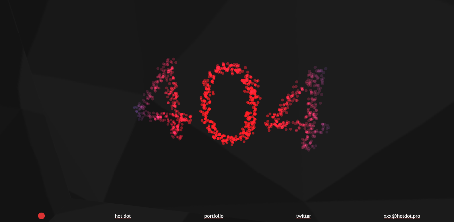
Hot Dot’s 404 page is simple but fun. The dots which comprise the 404 message respond to your cursor movements. Not everyone has time for a full game of Space Invaders… But something this simple can feel quite satisfying to interact with, if only for a few seconds.
Email Center UK – https://www.emailcenteruk.com/404
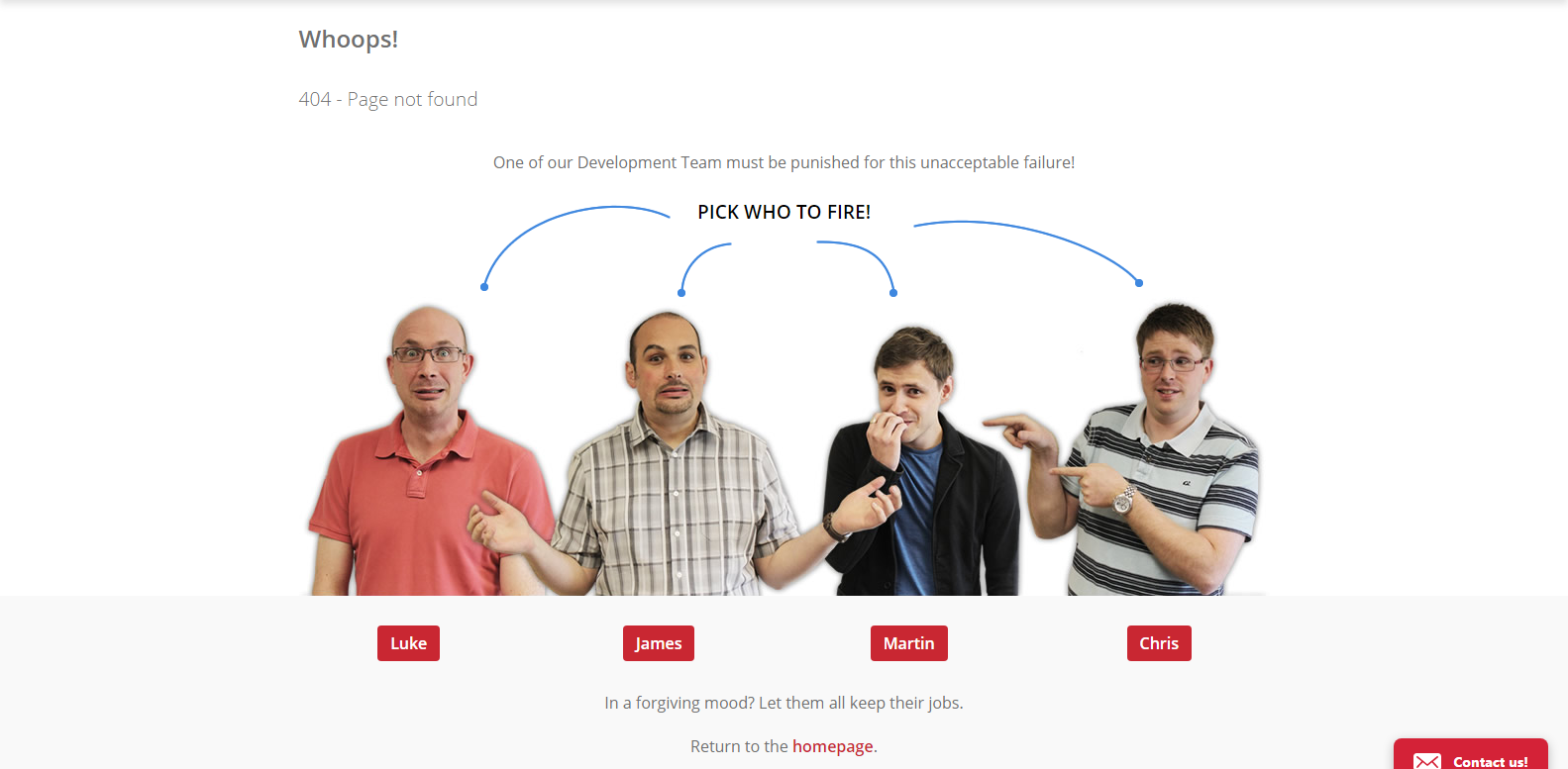
Not only does this 404 page by Email Center UK have a personal touch, with photos (I assume) of the developers who actually work there, but you can actually click on the developer that you want to fire. It then takes you to a page depicting your chosen team member getting fired with a funny message that gives you a little info on the person you just fired – and why you should feel bad about it!
Whitespark – https://whitespark.ca/404
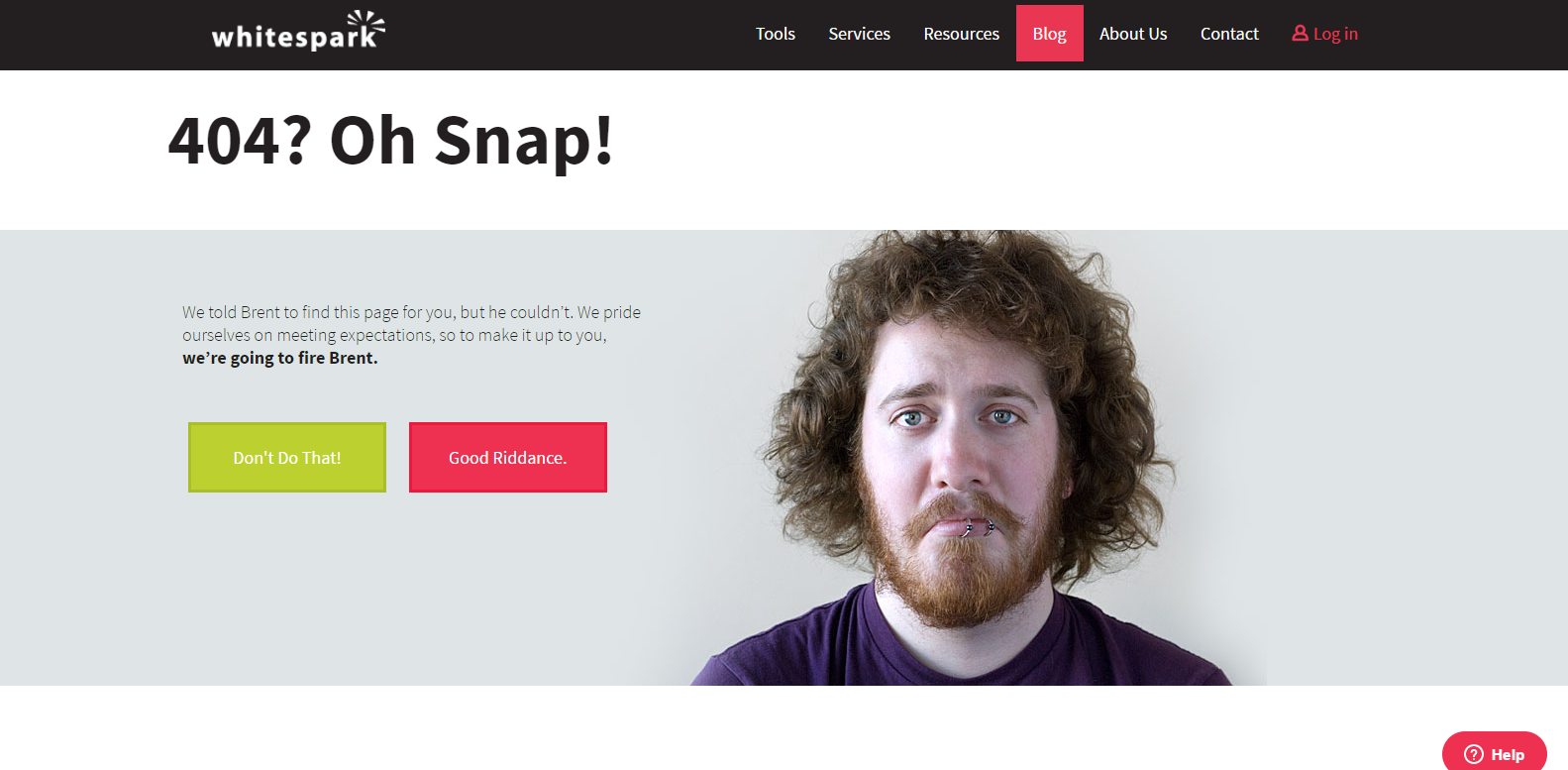
Whitespark has a similar 404 page that threatens the firing of Brent, their developer. Depending on whether you choose to fire him or not, you’ll be displayed a different message on the next page.
Bitly – https://bitly.com/404pagenotfound
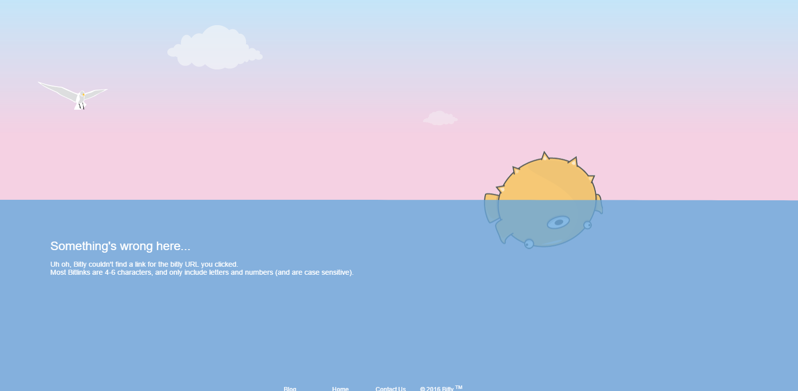
Bitly’s 404 page is simple but beautiful. You only realise it’s interactive when you move your cursor over the surface of the water, causing ripples. Very subtle, but very effective. They also give you a little bit of info about Bitly’s URL formats, so you can see whether there’s perhaps a mistake in the URL.
Imgur – http://imgur.com/404
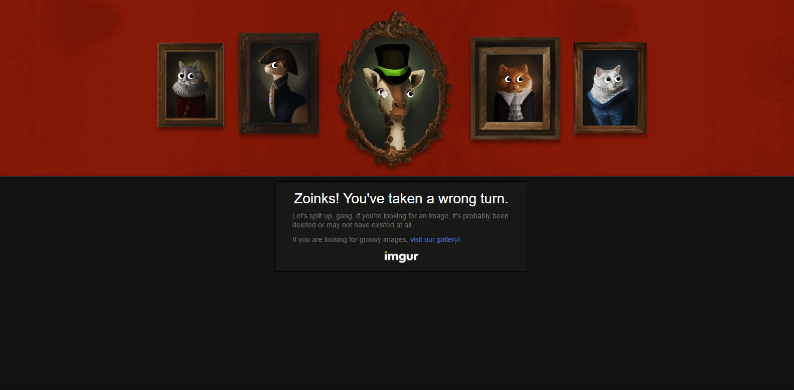
Another subtle 404 page that at first looks quite static. Until you realise that the eyes eerily follow your cursor around…
Github – https://github.com/404
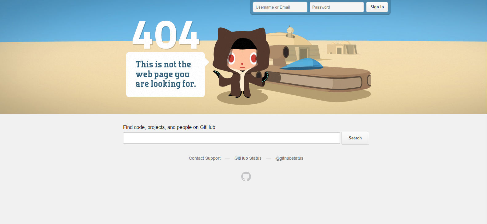
Github understands their typical user demographics, so they figured that their users would appreciate some Star Wars humour. Moving your cursor around changes the perspective of the visual elements in the foreground and background, creating a 3-dimensional effect.
Blue Foundation Media – https://www.bluefountainmedia.com/40
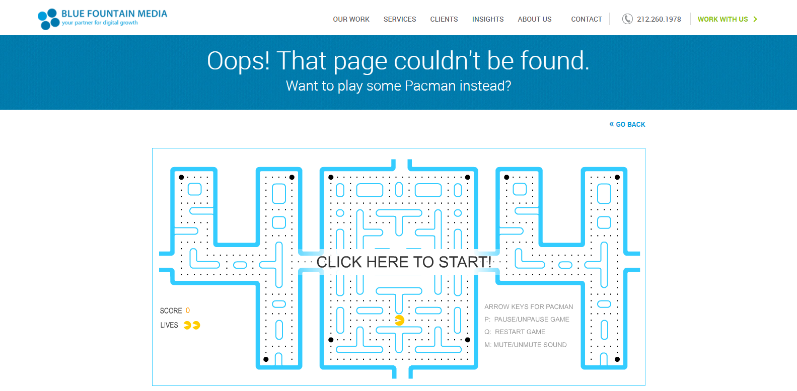
Pacman! Though it does require Flash to play… which might not be so ideal in this day and age. If you’re looking for a game to put on your 404 page, make sure it’s in HTML5. I had to enable Flash for this website, in order to even see anything on the page.
Mattel – http://play.mattel.com/404
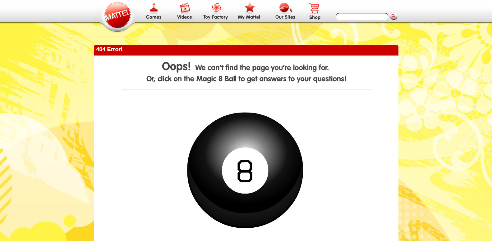
Another one that requires Flash, but if you enable Flash in your browser then you can click the 8 ball to get an animation that displays an 8 ball answer to all life’s questions…
![]()
Funny 404 Pages
Making an interactive 404 page isn’t for everyone, and can require a level of skill that you may not have or more time than you can dedicate to just a 404 page. But when it comes to funny 404 pages, so long as you have a sense of humour, you don’t need to break the bank (or your developers’ will to live!). Some of the funniest 404 pages are based on the image or text content on just a standard landing page template. For double points, ensure that the humour is relevant to your brand!
South West Trains – https://www.southwesttrains.co.uk/404
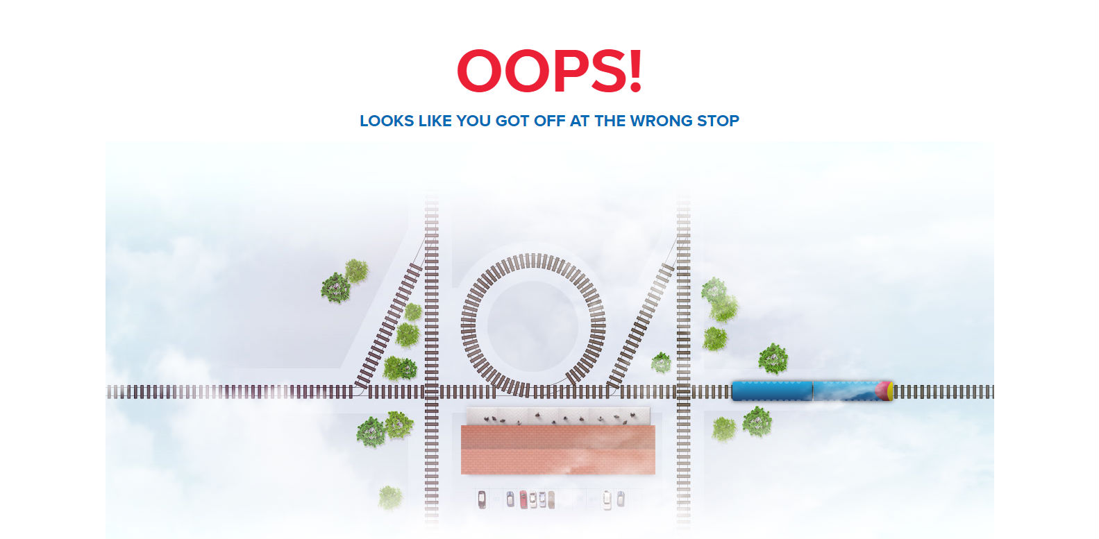
South West Trains’ 404 page displays their tongue-in-cheek train humour, with a moving train that drives across your monitor and pauses at the 404 station.
Geek Squad – http://www.geeksquad.co.uk/404
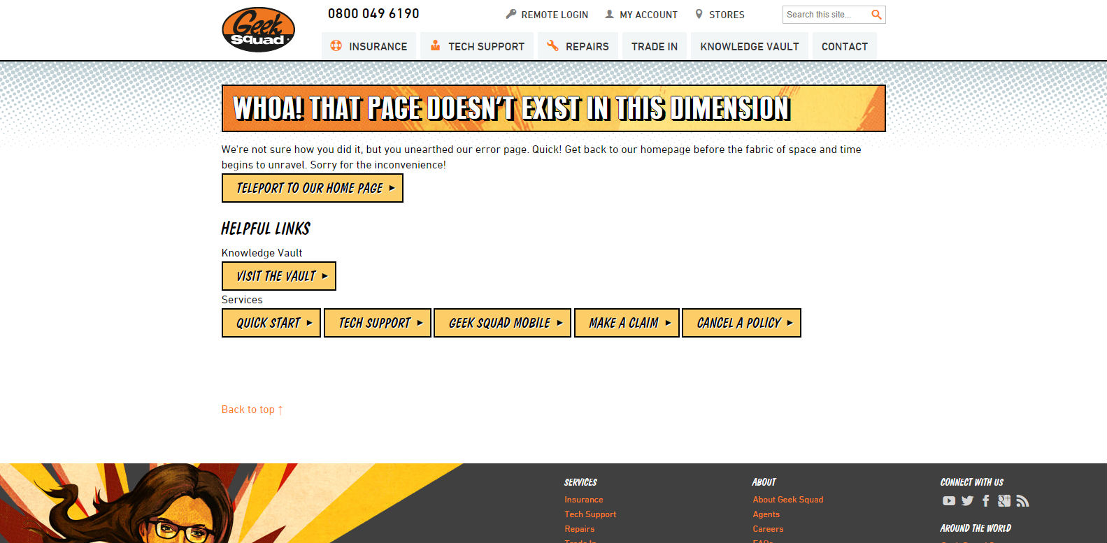
Geek Squad’s 404 page isn’t flashy or particularly eye-catching, but it tells a story. Through this simple narrative of unravelling the fabrics of space and time, they appeal to their user base and stick close to their branding. They even apologise and offer some helpful links to help the user get to where they need to go.
I Plan Websites – http://iplanwebsites.com/404

Looks pretty boring, right? Well, I don’t want to spoil the ending for you, but if you scroll all the way down you will eventually see a happy, prancing sheep that guides you to the homepage with a simple message: “Baa baa, this way sir.”
What more could you want from a 404 page?
Hootsuite – https://hootsuite.com/404
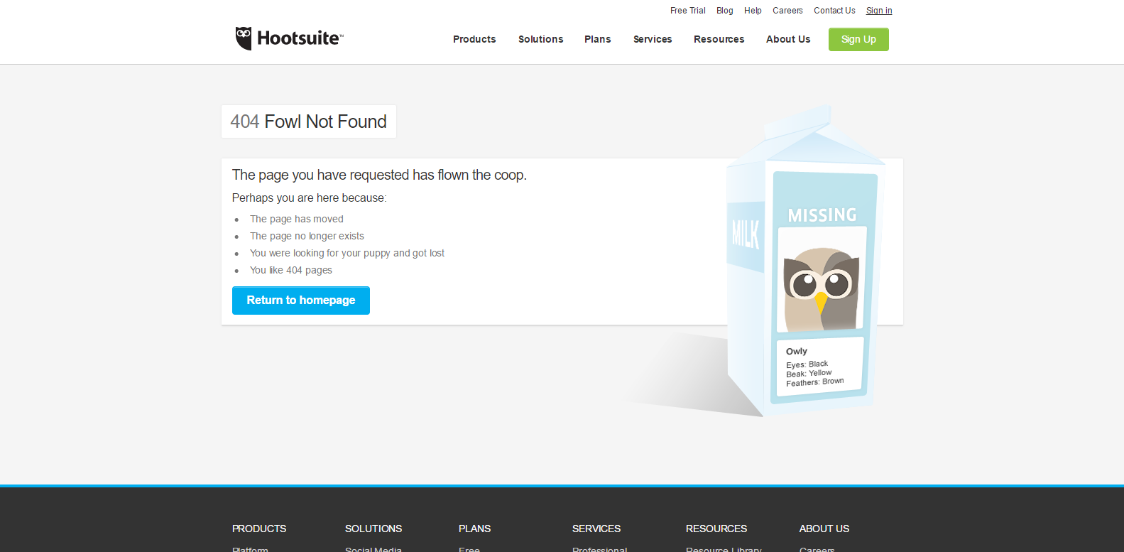
Hootsuite’s 404 page is simple, but cute. They provide some gentle humour in the form of owl-based puns (pertaining to their owl-themed branding), while informing the user why they may have arrived at the 404 page.
Brainchef – http://brainchef.com/404

The 404 message that just keeps typing messages to you… not sure how long it goes on for. A while!
IMDB – http://www.imdb.com/404
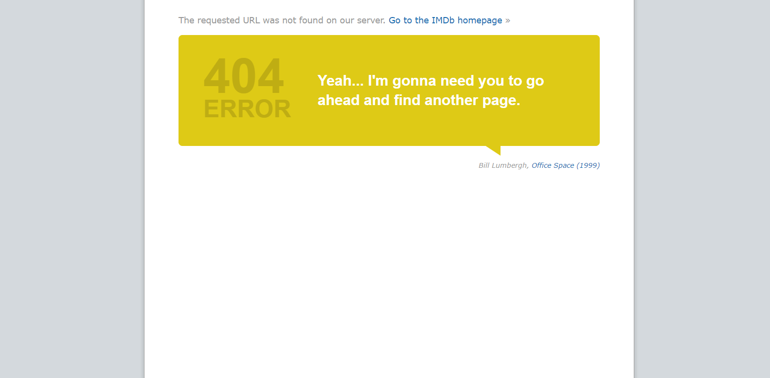
IMDB’s 404 page displays a different movie-inspired quote about the page not being found every time you land on it. Go ahead. Try refreshing a few times and see what you get. The 404 page includes a link back to the homepage and the link of the movie that the quote is from.
Dilbert – http://dilbert.com/404
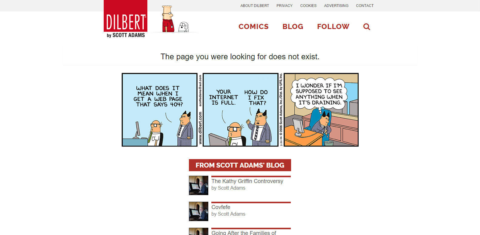
In line with the rest of the Dilbert comic strips on the website, the 404 page displays a funny comic strip about 404 pages. How meta! Whilst still retaining the usual website layout, so you don’t feel out of place being there.
Nouveller – http://nouveller.com/404
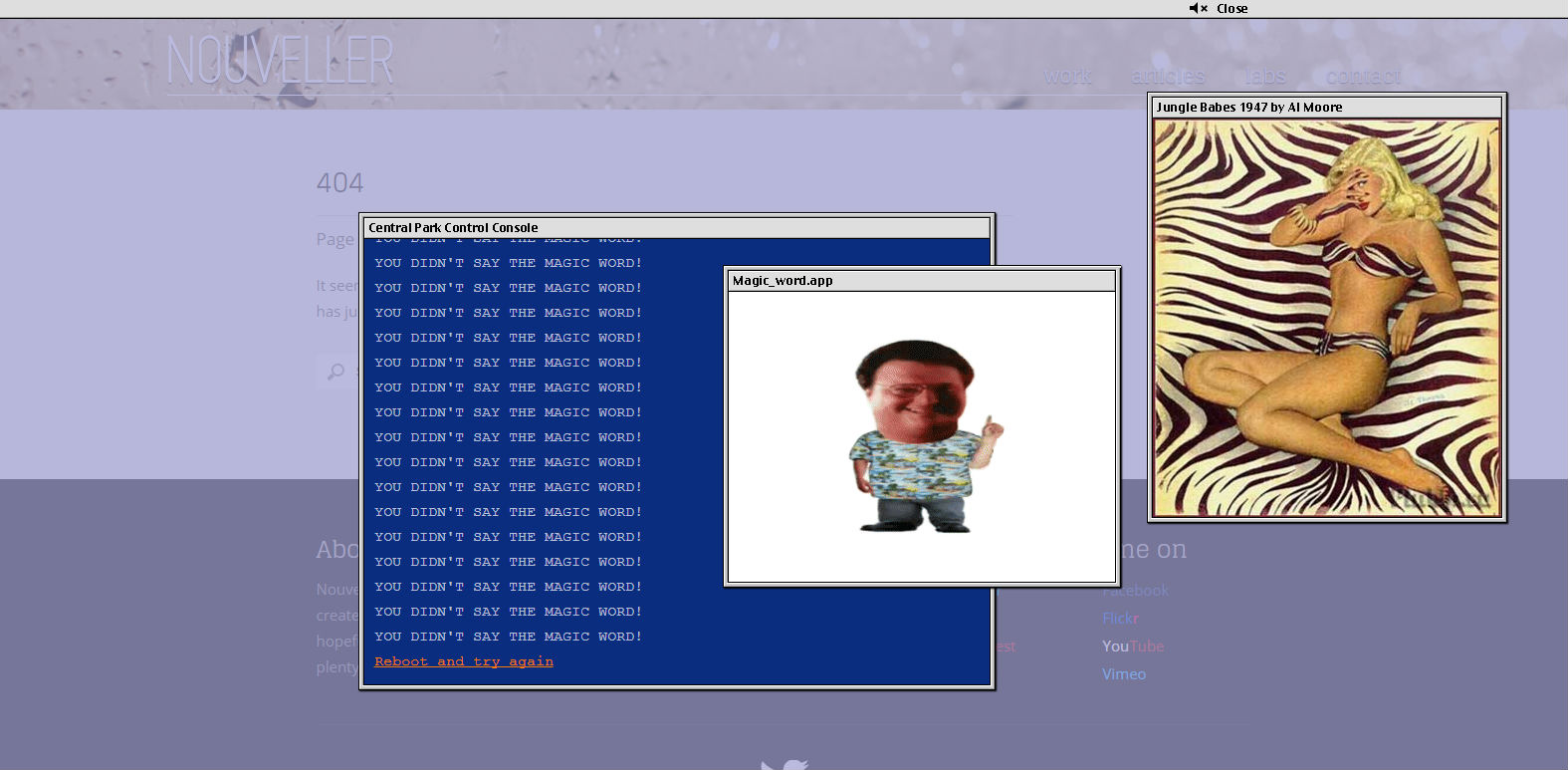
Jurassic Park fans are going to love this one. You arrive at the 404 page but you can’t get access into the park’s security. The console allows you to type a few things to try, such as “reboot”, “help”, “access security”, or whatever. After a few failed attempts, you get the legendary “ah, ah, ah… You didn’t say the magic word!“. How frustrating!
![]()
Weird 404 Pages
Bloomberg – https://www.bloomberg.com/404
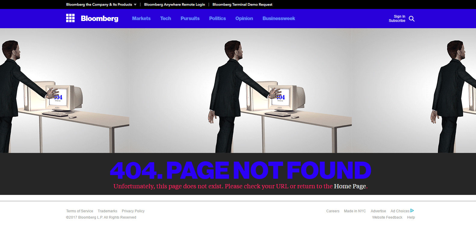
This one has to be seen to be believed… it’s just bizarre. I promise you. Just go to Bloomberg’s 404 page. It’s worth it.
Considering who Bloomberg are, arriving at this 404 page is a surreal experience.
Blue Egg – http://bluegg.co.uk/404
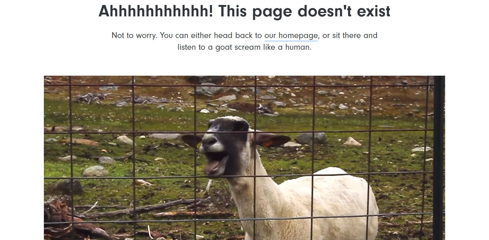
You might want to turn your headphones down a little for this one… Nothing informs that you are in the wrong place quite like a goat screaming at you. Thankfully, they provide a quick link to their homepage.
![]()
Informational 404 Pages
Some websites and businesses may find it inappropriate or not on-brand to feature a quirky or funny 404 page. But sensible 404 pages don’t have to be boring. They may be the perfect opportunity to provide company information or interesting facts about the company that the customer may not be aware of.
Magnt – http://www.magnt.com/404/
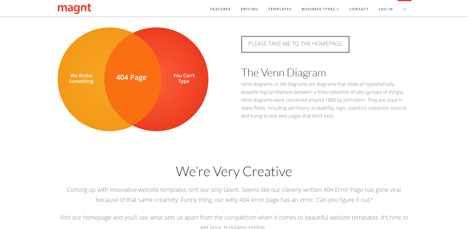
Magnt’s 404 page educates the user (in an admittedly tongue-in-cheek manner) as to why they may have landed on the 404 page in the form of a Venn Diagram. Of course, this is in addition to condescendingly educating the user on what a Venn diagram is. Magnt also use this opportunity to further sell themselves to the user further down on the page, boasting their creativity hailing their 404 page as evidence of their talent and wit.
Poem of Quotes – http://www.poemofquotes.com/404
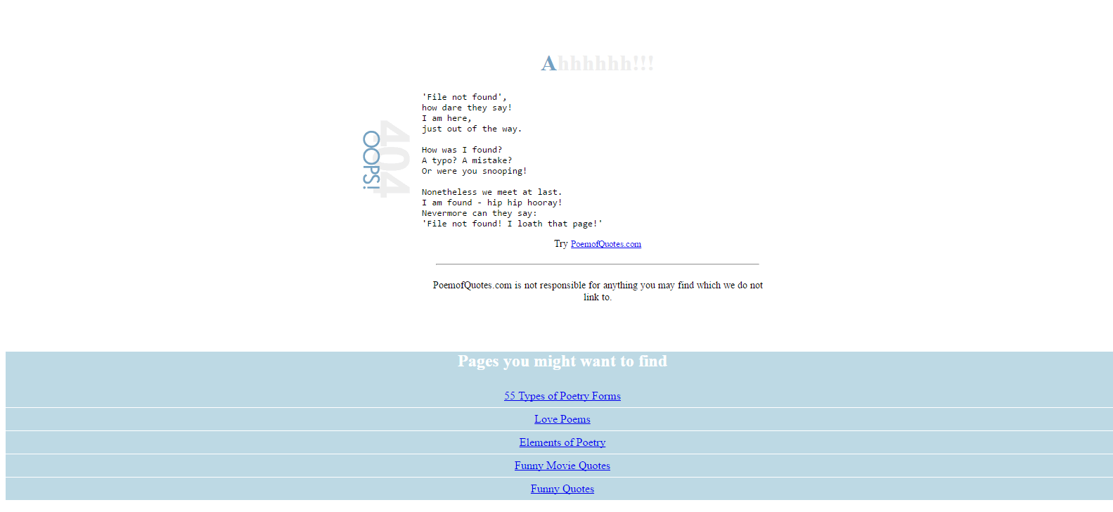
A poem website with a 404 poem, that explains why you might not have been able to find the page, and includes a link to the homepage. Probably the most appropriate medium for informing their poetry-loving readers that the page cannot be found.
Amazon – https://www.amazon.com/404
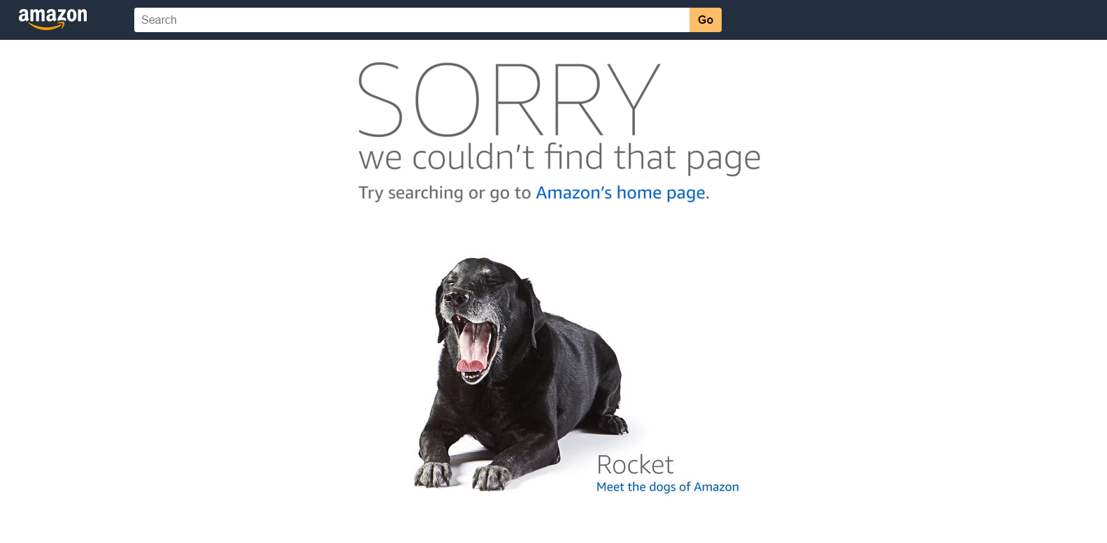
Amazon.com uses their 404 page to tell users about their office mascots. If you click on the dog, you are taken to their Dogs of Amazon page, which shows you profiles (including the breed, age, favourite toy and the things they love) of all the dogs that come to work with Amazon employees. This establishes Amazon as a dog-friendly company, and explains how all Amazon employees are invited to bring their dog to work with them. It’s just a shame that amazon.co.uk doesn’t have a meaningful 404 page…
![]()
Visual 404 Pages
Visual 404 pages use imagery to present the 404 error to their users in the form of a video, image, or animated background. They’re often clean, simple, and are there to be visually interesting while encouraging users to quickly navigate to where they want to go without too much distraction.
Bored Panda – http://www.boredpanda.com/404page
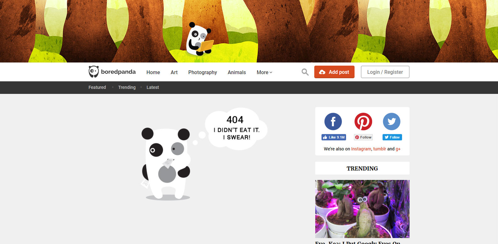
Bored Panda’s 404 page is simple and doesn’t affect the usual layout so users are familiar with how to proceed with navigation. There’s just not much to it, and that’s not necessarily a bad thing!
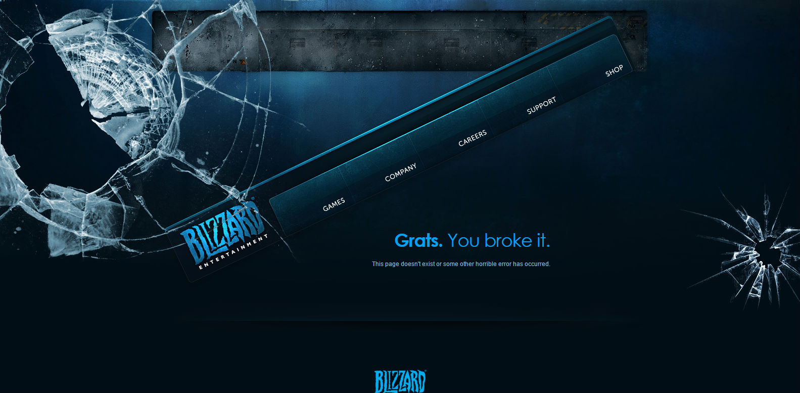
Blizzard – http://us.blizzard.com/en-us/error.html
Blizzard’s 404 page is quite genius. The navigation menu appears to have been broken – but, despite being at an awkward angle, it still works! Whereas some 404 pages don’t offer any visual encouragement to explore further via the main navigation menu, by presenting it to the user like this in a way that highlights its existence and brings it to the centre of the screen, Blizzard’s 404 page entices users to click it. Even if it’s just to see if it still works! Genius.
Virgin – https://www.virgin.com/404
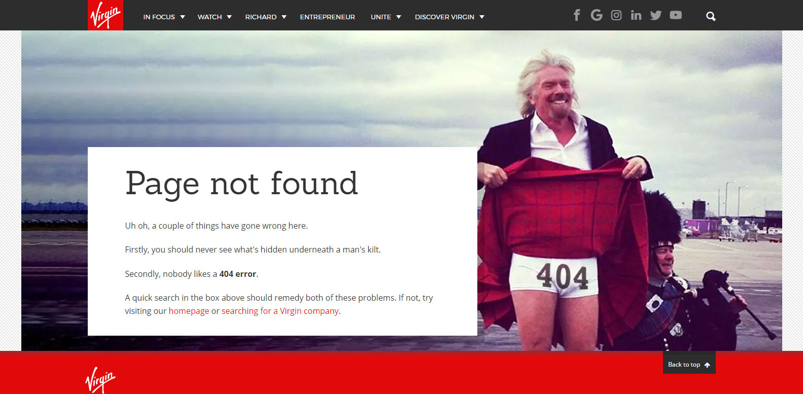
More visuals than you need…
![]()
Enjoyed these 404 pages? Check out our one!
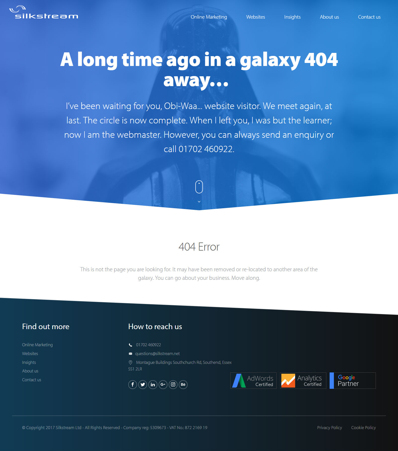
Hopefully, you’ll never have to come across it in the wild…
Hi Ria
I was surprised to see how companies had utilized the 404 error page make it more compelling.
I haven’t thought of doing such.
But I will give a try to make customized 404 page.