We were asked to take over the brand new website design for the rebranded ESP Display (formerly ESPPOS) after the display brand was acquired by Alplas.
The new website needed to be fresh and vibrant but still professional, and much of the aesthetic was contributed by Alplas to keep it inline with their brand. It was also important for the website to be mobile-friendly – but we would never dream of designing a website that wasn’t mobile-friendly in 2017!
ESP manufacture and sell display accessories for B2B and B2C businesses, so visual imagery and straight-forward navigation are key components for their ecommerce site. The ESP Display website also features a lot of bespoke eCommerce CMS functionalities, specifically developed for their business.
The Homepage Design
(Click image to expand homepage design:)
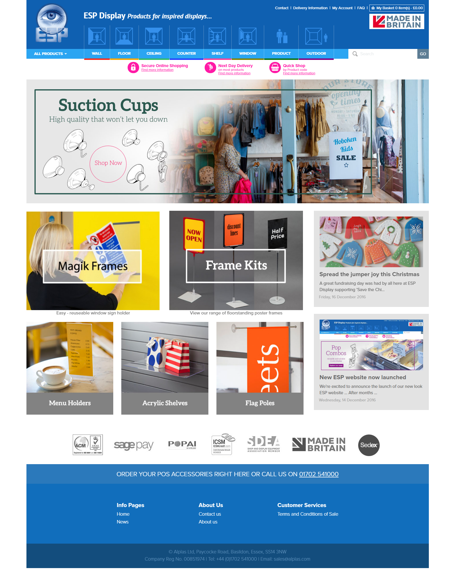
The homepage itself is simple and image-rich, showcasing a handful of the most popular categories, displaying their two most recent blog posts and greeting visitors with a large “above-the-fold” carousel. Visitors can click on one of the featured categories straight away to start shopping for products, or browse through the navigation to find what they are looking for.
The navigation for ESP Display is quite unique from its competitors in that visitors can browse categories and subcategories by the location in which the product would be displayed. Locations such as Wall, Floor, Ceiling, Counter, Shelf, Window, Product and Outdoor.
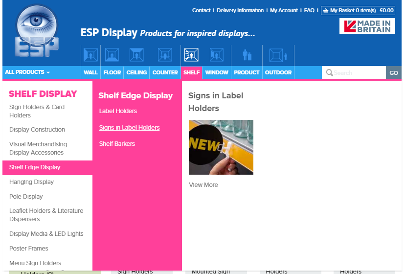
For example, hovering over the “Shelf” icon, the Shelf Display menu will drop down listing the categories and subcategories. Clicking the category (or subcategory) name of the product they are looking for will bring up the category filtering the products so the visitor will only see products that can be displayed at that location. So clicking on Sign Holders under Shelf Display will take you to only Sign Holders that can be displayed on a shelf and not any that would be displayed on a window or hung from the ceiling, etc.
This allows customers to browse products from a very specific product list, saving them time if they were to only be purchasing types of products for window display or ceiling display or wherever.
Alternatively, they can browse via the “All Products” dropdown menu to see full product lists under each category, unfiltered by location.
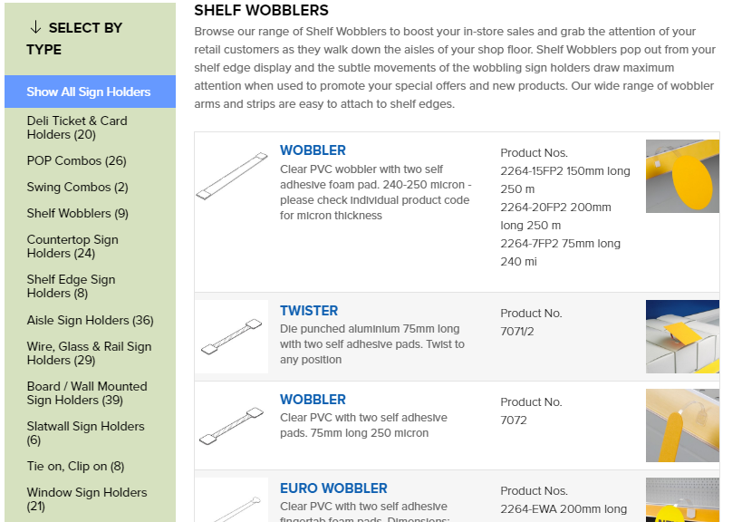
The Category Design
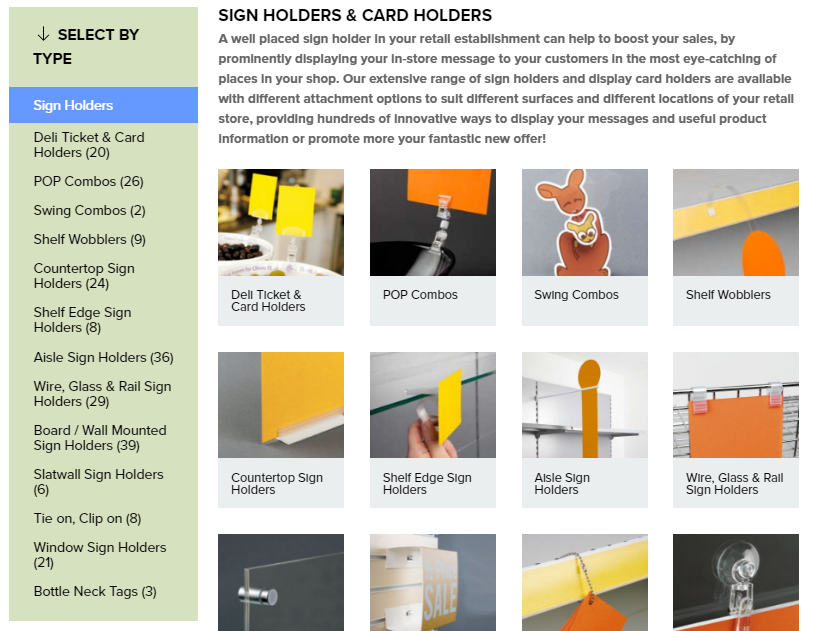
Category pages (such as the Sign Holders page shown above) list the different subcategories available within that category, with images to show the types of product in situ. The clear imagery displayed in this way allows for easier browsing, so customers can find exactly what they are looking for based on the pictures alone. Written content is displayed above the visual menu for SEO.
The Subcategory Design
The subcategories contain the list of products within that subcategory. Similar to the main category pages, there’s a generous space above product listings where content can be written for SEO. Each product listing in the subcategory displays the product name, information and numbers. As well as a clear manufacturer’s illustration of the product and photo of the product in situ. Browsing products couldn’t be clearer.
The Product Page Design
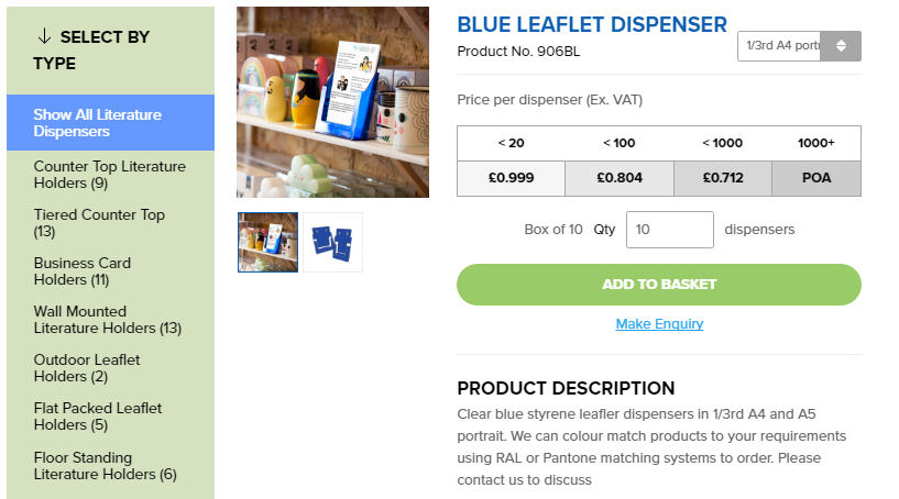
The product page is clear and simple. There’s a price sheet which allows customers to see the price depending on the quantity they’re purchasing, and the price per unit will update based on this quantity.
Multiple images can be uploaded to each product for customer viewing, there’s plenty of space for a product description and an options dropdown menu is disabled next to the Product No. for colours and sizes selections.
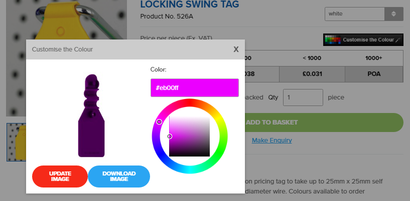
Products which are available in custom colours also feature a colour picker, so that customers can view the product in the hex colour of their choice and even download an image of the product in that colour.
The Basket Design
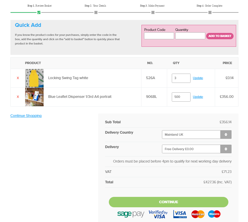
The Basket page shows each step of the buying process at the top of the basket, and lists each product and its quantity below. Customers can make changes to their basket here, editing the quantities or removing products altogether. There’s even a Quick Add options so that repeat customers can add items to their basket without having to browse through the website, if they already know the code and quantities from previous orders. Delivery options are also selected here.
The Info Pages Design
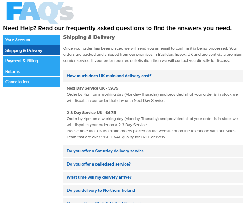
There are a number of info pages also available on the site which can all be edited via the CMS. The FAQ page, for example, allows for different FAQ categories in the sidebar with questions that expand to show the answer when clicked. Customers can get their questions answered easily with this simple navigation.
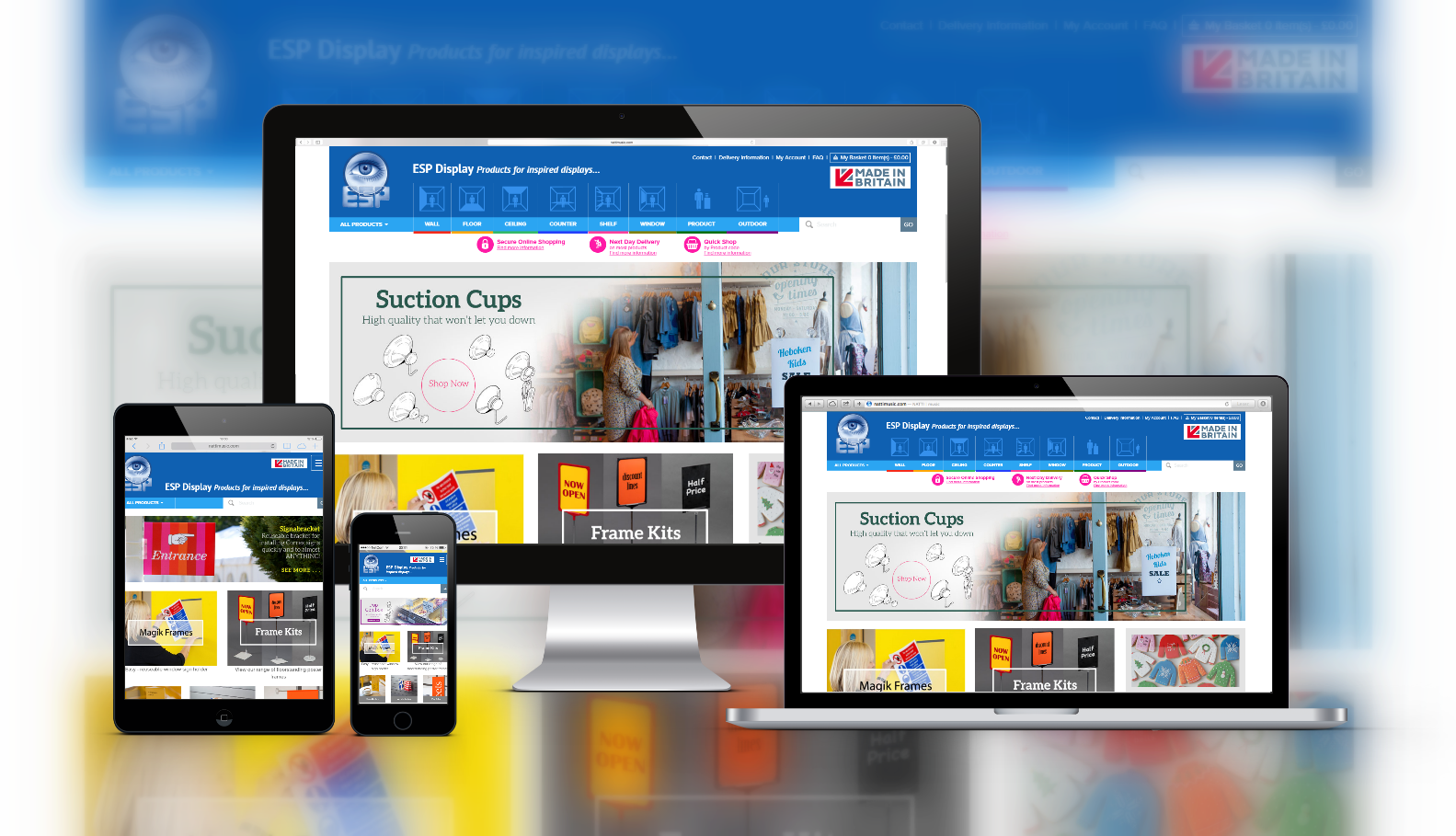
And obviously it’s responsive too…
Mobile-friendliness is a crucial factor for ranking well in Google if you want to be found by mobile users, and deliver potential customers a better user experience on-site. Thanks to responsive web design, ESP Display’s website is 100% responsive and mobile-friendly!
This means that users can browse the website from a smartphone, tablet or desktop computer and have the same brilliant experience that they expect from the ESP/Alplas brand. Without having to pinch and swipe frantically to find what they’re looking for! No matter what size the screen, ESP Display’s website will automatically adjust to fit the screen size and move elements around to ensure that the website works and looks fantastic on any device.