
Earlier this week on 26th January 2015, we all heard the whisperings of a new Google search algorithm update being unleashed upon the unsuspecting – to which Google’s John Mueller officially commented that it was neither Google’s Panda nor their Penguin causing the fluctuations in rankings…. Could it be? Could it finally be Google’s Mobile algorithm update that we’ve all been expecting for the past year?
Google spent the entire duration of 2014 pushing webmasters toward making their websites more mobile-friendly. So it’s no wonder that the year 2015 has started with Google punishing those who didn’t listen. It’s no longer a question of if and when you should make your website mobile-friendly; you should already be there by now. And if (for whatever reason) you’re a little late to the game, you may see your mobile rankings drop quite dramatically, and thus your mobile traffic, mobile sales, and so on.
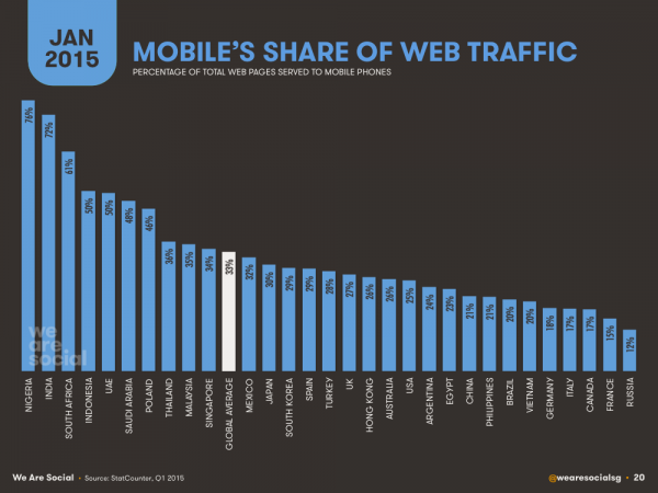
Mobile penetration is at its all time highest, with approximately a third of all web pages being served to a mobile phone. So why wouldn’t Google want to give all of their users around the world the best user experience? And the only way to do this is obviously to only display mobile-friendly websites to mobile users.
Making sure your website is mobile-friendly should be TOP priority in 2015!
How The Mobile Algorithm Update May Affect Your Rankings
You may notice that, if you do not have a mobile-friendly website, though you may maintain high rankings on desktop, you may get bumped down for the same search terms in the mobile search results. Likewise, if you have a mobile-friendly website but your competitors do not, you may experience a noticeable boost in your mobile rankings. To see if you’ve been affected, you can compare your rankings for your target keywords on both desktop and mobile search results. You may see that even though you’ve been rewarded the “mobile-friendly” label, there is still a significant difference in your mobile vs desktop ranking. You can use Google Analytics to segment your organic mobile traffic and see how the update has affected you, if at all.
Mobile Usability Reports in Webmaster Tools
In October 2014, Google announced a new feature in Webmaster Tools, aimed to provide webmasters with feedback regarding their website’s mobile usability. Google’s John Mueller said that Google “strongly recommend you take a look at these issues in Webmaster Tools”, hinting at what we all knew would eventually become true: Google are planning on making mobile user experience and usability one of their ranking factors in their search algorithm.
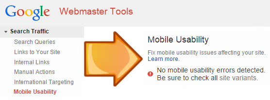
You can access your website’s Mobile Usability report in Webmaster Tools, listed under Search Traffic.
Over the past couple weeks, it has been reported that Google have been sending out mass notifications to website owners via Webmaster Tools, warning them if their website isn’t considered to be mobile-friendly. Within these messages, Google state that pages with critical mobile usability errors “will not be seen as mobile-friendly by Google Search, and will therefore be displayed and ranked appropriately for smartphone users” (bold for emphasis). It should have been obvious at this point that we should expect the release of Google’s mobile algorithm update very soon – but many of us just regarded it as Google promoting Webmaster Tools’ new Mobile Usability feature. And their Mobile-Friendly Test. And their Mobile-Friendly Labels. Well, when you put it like that, there was no way in hell that they weren’t suggesting that a new mobile algorithm update was on the horizon.
Google’s “Mobile-friendly” Label
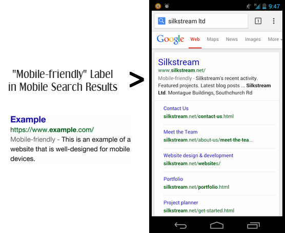
In November 2014, Google introduced their “mobile-friendly” label to their mobile search results, stating that they would be rolling out these labels globally over the upcoming weeks. They also confirmed that they have been experimenting with using the mobile-friendly criteria as a ranking signal.
“A page” implies that websites are rewarded “mobile-friendly” labels on a URL by URL basis, much like how Google’s HTTPS algorithm works, rather than site-wide.
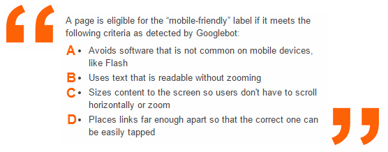
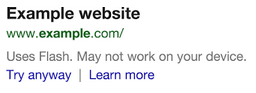
A) In 2015, you should not be using Flash as a way to display important information on your website. In fact, the less Flash the better. Google now issue warnings to non-Flash device users when they appear in the search results:
B) Of course, for great mobile user experience, you don’t want your users having to zoom in and out to read text content on your web page.
C) Sizing content to the viewport on both desktop and mobile devices is essential for great user experience. Avoid fixed width elements where possible, and check out our guide on mobile-friendly web design!
D) Google’s PageSpeed Insights can actually detect when certain tap targets are too small or too close together. Again, user experience is key and it’s no good for your users when they keep accidentally mis-tapping!
How To Check If Your Website Is Mobile-Friendly
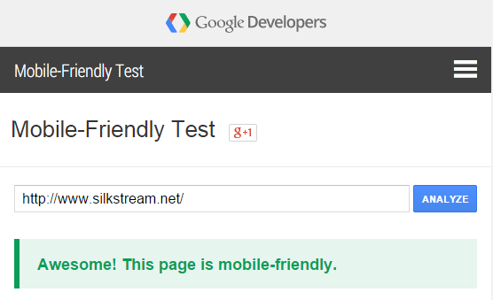
You can take Google’s Mobile-Friendly Test here for free, and though it doesn’t go into too much detail with the why’s and the how’s, it’s a great tool to just quickly see whether your website or webpage is mobile-friendly or not. Especially if you aren’t able to see the “mobile-friendly” labels directly on your mobile device yet.
Read more: Guide To Mobile-Friendly Website