
There couldn’t be a bigger time for Apple: it’s been ten years since they announced the iPhone and to mark the occasion they’ve released a whole array of new products including three iPhones – two that are similar to the previous lineup whilst another that comes with revolutionising features, such as a bezel-less screen, wireless charging and facial recognition software to assist you in unlocking your phone whilst too enabling a whole array of cool features such as a more precise augmented reality (AR).
Out of all the products released at the Apple event, the iPhone X plays the role of most significant when it comes to the world of web design and development, opting to add a notch on their previous pristinely rectangle screen, leaving a bump – if you will. This bump-like addition can now see a blank space left on either side of your web page when viewed in landscape mode on this new mobile device – with a chunk missing from the side in which you choose to lose from rotating the mobile device. When viewing content fullscreen in portrait mode, the ordinary and most used way in a mobile, you also end up losing the top chunk of the fullscreen webpage; something that many individuals, especially in the world of web design will find unpleasant.
The occasion of the worlds most mainstream phone and technology company releasing this change to one of their upcoming devices, a change that is likely to stick around with future devices will now see websites that have navigational panels across the top of their sites web pages now deemed as broken to the end user. This will bring with it numerous user experience problems, with web content now being hidden unexpectedly from the user, if not cut into, establishing a nightmare for web designers and users alike.
There may be some who see this change in the iPhone as temporary and opt to not catering for what could be a tremendous amount of users who are set to use such device, but that’s truly where such fall lies. With Apple being known to stick to guns when it comes to making additions or reductions – the iPod scroll wheel, the iPhone and iPod 30-pin cable and the headphone jack :for example, it’s likely that the iPhones bezels have indefinitely disappeared till the next best thing and such stance will ensure Apple stays competitive.
Others may underestimate the power Apple has in the mobile market: although they may be a company many accuse of copying its competitors with features years after they’ve been introduced, Apple plays a significant role in first introducing a lot of features to the mass market and indeed to its competitors that want a bite of Apple’s market share. Time will only tell if these competitors decide to take on a bezel-less, notch-added screen design.
With there being a fast-paced momentum to cater for the iPhone X, you may be wondering how you can design your website around the iPhone X notch to best serve those site users? Luckily, Apple has released some important guidelines to assist you in developing the perfect site for such mobile device.
The Official WebKit Guidelines
In the official guidelines released, Apple has shared developer information for two types of websites: pre-existing websites that haven’t made any changes to their site and websites that wish to ‘take advantage’ of this new notch addition.
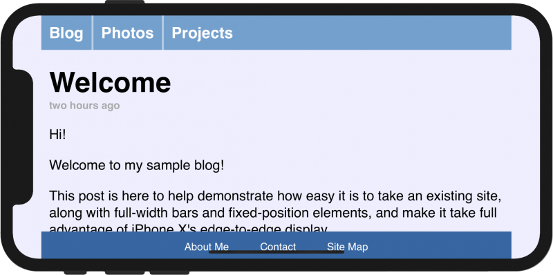
Apple has said that those sites that choose not to remedy their site to best fit the iPhone X will see the “empty” or – insert area – that will now feature on each side of the web page when viewed horizontally to automatically utilise the page’s background-color (used in <body> or <html> elements) and to appear as a solid background colour in these areas.
This sees a website render like so:
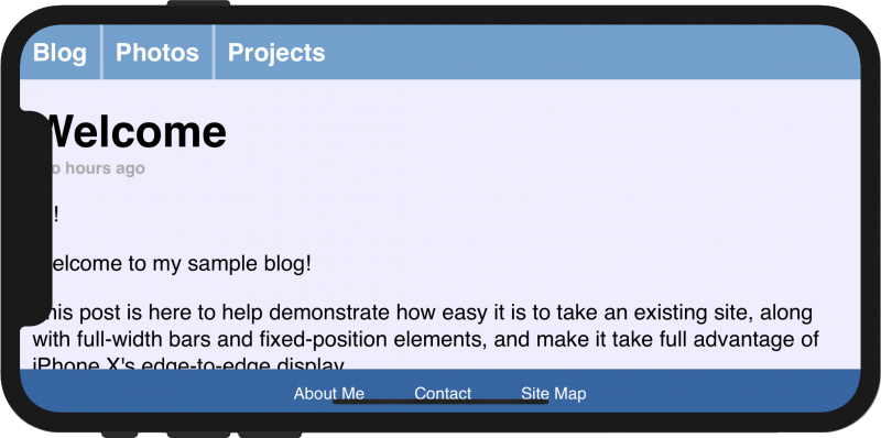
However, websites that wish to keep up with the everchanging technical landscape and to take advantage of the notch have been assisted with a new CSS Round Display Spec viewport feature, namely viewport-fit which is set to provide an ability to control the inset behaviour of a page on a mobile device. This feature comes with two values for web developers to add: auto and cover. The auto setting for this new viewport setting will see the site appear with the empty page margins when viewed in horizontal, whilst cover will hide a section of the page behind the iPhones new notch. An example of this code in action, seen on the Apple guidelines can be seen below:
<meta name='viewport' content='initial-scale=1, viewport-fit=cover'>
Implementing this code sees a website render as below:
Safe areas are now a major aspect when developing a website that is adequate for the iPhone X, with danger zones that should not see any important content present in. These include the area beside and around the notch, the bottom area of the mobile device and the side of the device that’ll see a scroll bar present. To help developers remedy issues with this, Apple’s WebKit for iOS 11 has implemented a new CSS function namely constant() and four additional pre-defined constants: safe-area-inset-left, safe-area-inset-right, safe-area-inset-top, and safe-area-inset-bottom. With these added, you are able to reference the size of the safe areas around a page that appear on each side. The new constant() implementation is also said to work anywhere that var() currently does, such as in the padding properties. An example given by Apple can be seen below:
.post {
    padding: 12px;
    padding-left: constant(safe-area-inset-left);
    padding-right: constant(safe-area-inset-right);
}
There’s a lot that is involved when it comes to managing a website for a mobile device that features a distinctive mobile resolution in a whole new size – especially when it includes a notch that cuts out of the previously pristine rectangle. As with all web design and development, it’s important that despite this you should never design a website solely around one device, but it’s still important to keep in mind how important this new mobile change may just be.